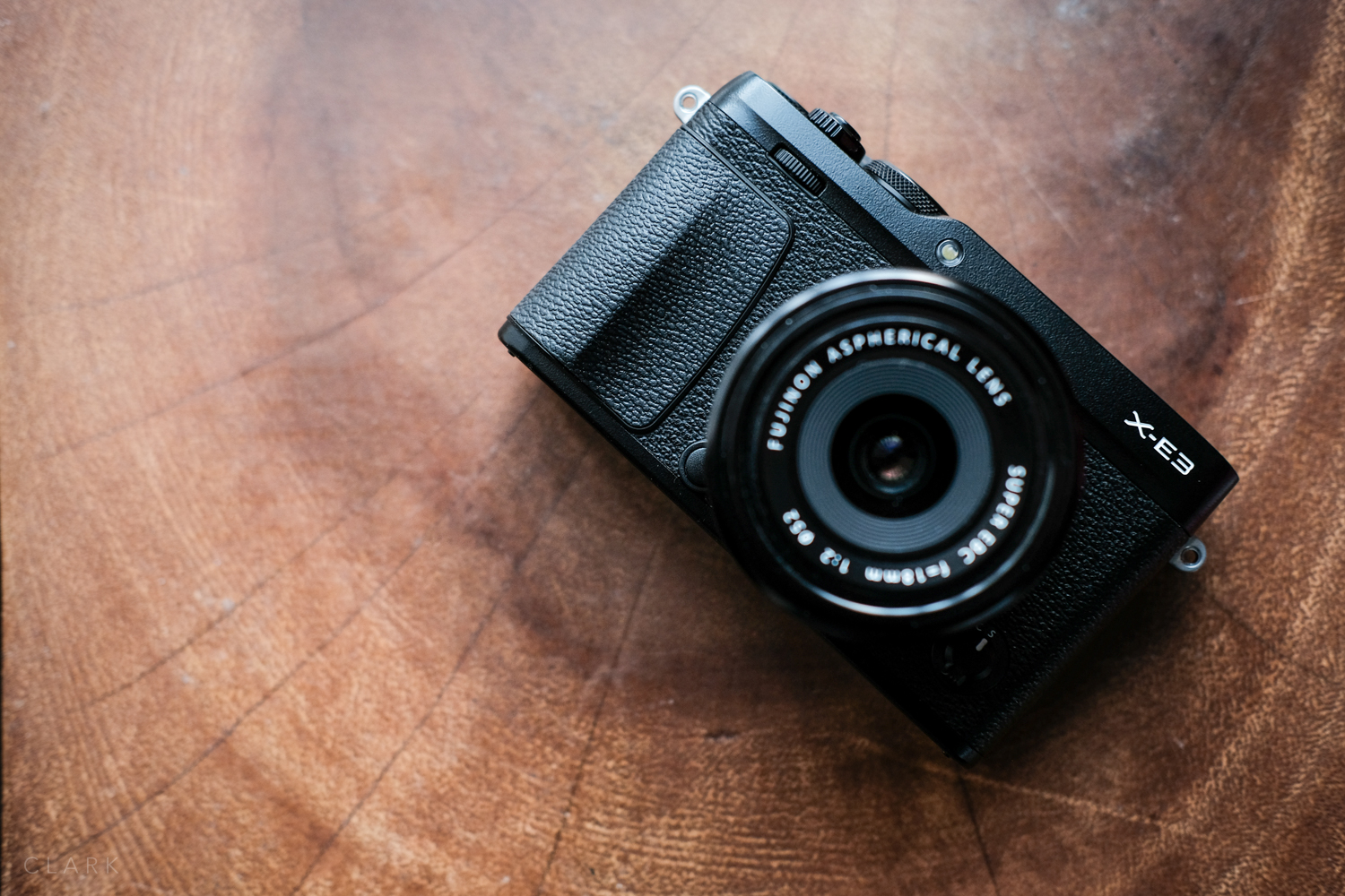
Small but perfectly formed (from the front), the X-E3 is a good looking camera
Back in the early days of the X-Series, I shot with the X-Pro1 and the X-E1 together (one on each side). Although their performance wasn’t even close to the super-powered X-100F, X-Pro2 and especially the X-T3 I shoot with now, they were so nice as a working pair. They were like the same camera in slightly different skins. As the X-Pro1 grew long in the tooth and the X-E2 came along, I started to use the X-E2 and the X100S (then the X100T) as a working pair. I was so into the X-E2 (and by that time the X-T1 had came along) that I didn’t think my setup had any room for the (then) soon to be released X-Pro2. That seems strange now because my X-Pro2 is always with me. Anyway, what I’m trying to say is that I’ve always loved the X-E cameras.
So when the X-E3 was announced I had that same feeling. My X-E2 was sitting in my desk drawer getting very little action and I was wondering if there was a space for this latest version in my current line-up. There’s only one way to find out. So I took one out for a week to see how it performed.
FIRST IMPRESSIONS
The first thing I noticed when I opened the Peli case, was just how small it looked and felt. It’s only slightly shorter than the X-E2, but it seems a good bit smaller in a few ways. The design on the front is a little cleaner I would say and the front grip is pretty much the same.
Not quite as wide as the X-E2 but it makes quite a noticeable difference
TOP PLATE
The top plate is almost the same as the X-E2, but the X-E3 doesn’t have a built in flash. There is no dedicated ISO dial, but the shutter speed dial is a little on the small side for an X-Pro2 style dial. The Fujinon logo has been left off, as it has on the X-Pro2, but I’d like to see a return of this logo on the top plates of all rangefinder style cameras.
MEET ME ROUND THE BACK
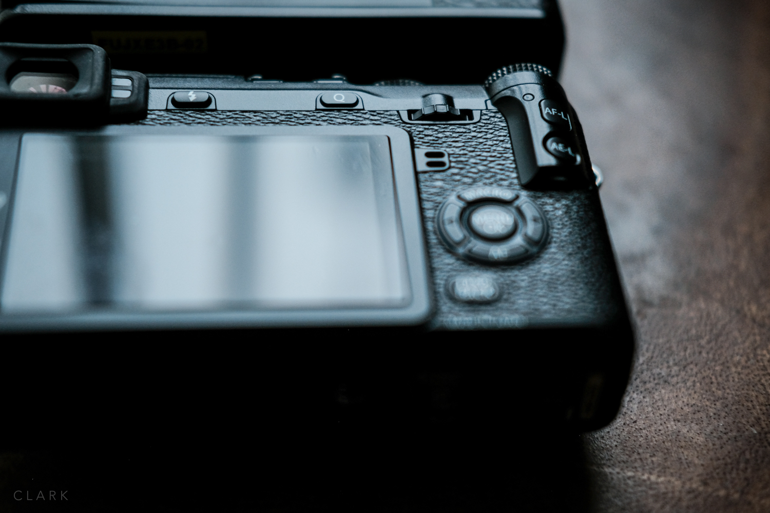
The back of the camera is where things get real (as the hip kids say). On the plus side, the thumb grip is perfect and results in the X-E3 being much more comfortable and safer to hold than it’s predecessors. The joystick has also been included. Fantastic! There are now three buttons along the back of the top plate (next to the viewfinder), like the X-Pro2. The diopter is to the left of the viewfinder, but recessed enough so’s not to get changed by accident.
IT’S NOT YOU, IT’S ME
Let's get the D-Pad touchscreen and button placement thing out of the way. As a photographer that owns and uses many X-Series cameras (often using two at a time), it drives me crazy that button placement has not become standard across all X-Series cameras. The X-E3 has the play button at the bottom, which is typically where the Back/Display button would be. For me, the Play Button should be at the top (below the joystick), with the Menu/OK button below that. Obviously different departments design each camera, but I wish all X-Series rangefinder style cameras could get a standard button layout.
X-E2 back with D-Pad and a much more tactile thumb wheel.
I love the D-Pad on all my cameras. It's basically 4 function buttons in a small space that I can control in the dark without taking my eye away from the viewfinder. I have the D-Pads on all my cameras set up (as much as possible) the same way. But the D-Pad has been omitted from the X-E3 (even though there's space for it). This is a deal breaker for me. I was worried that this would become the norm going forward, but I was happy to see a D-Pad on the X-T3.
I mostly hate touch screens, but I find the one on the X-T3 very useful for video recording. I would have left it off of the X-E3 though. Like the touch screen on my X70, I turned it off on the X-E3. But before I turned it off, I went out and shot some street photography. The touch screen function buttons, where you can swipe at the top, bottom, left and right side of the screen is the worst feature on any camera I have used. Every time I lifted the camera to my eye, something else had changed and it took me a while to work out it was that dumb touch screen. But it does have one useful feature…called OFF.
The Auto switch is so useful when shooting street photography, jumping from full manual to auto
I was super pleased that the X-E3 has an Auto button on the top plate. I use this often on my X70 as I tend to shoot street photography totally manual with the focus also set to a fixed distance (click HERE to see my post about zone focusing). But when I step inside a building and the light changes or if I want to grab a quick shot close up or far away without upsetting my settings, I simply switch to Auto, grab the shot and switch back to manual. Love it!
Image quality is exactly the same as the other X-Series cameras as they all share the same sensor
SIZE MATTERS
The X-E3 is very small, even smaller than the X-E2, but it feels so comfortable in my hand. Part of it is due to the front grip, but mostly to the rear thumb grip. Although this camera is a standard X-Mount and can take any of the XF or XC lenses, it is definitely better suited to the smaller lenses. I automatically attached the 18mm f2 straight away when the body arrived, and it's just perfect for it. Although the 18/2 could do with an updated mkII version with internal focusing and even weather-proofing (if that's your thing), it's still a great little lens and so well suited to the X-E3. But basically, any lens that is physically small, like the 27/2.8, 35/2, 23/2 will be great on this camera. Obviously, the larger X-Series lenses will work on this camera but will be very front heavy.
WHO IS IT FOR?
Where the X-E2 felt more like a backup for the pro photographer with the X-Pro1 or X-Pro2. I feel the X-E3 is aiming more at people that love shooting with smartphones but want to take it up a notch. It would be a fantastic little vlogging camera, but lacks the flip round screen of the X70.
I hate a smeared LCD screen but there's no escape with a touchscreen
CONCLUSION
The X-E3 is a damn fine camera. The performance in such a small body is stunning! And though It bothers me a that they omitted the D-Pad, I do think this camera will do extremely well for Fujifilm. New parents that want to document their kids life in very high quality won’t go wrong with this with a 35/2 lens attached. At the moment, I’m shooting with an X-T3, X-T2, X-Pro2, X100F and X70, so I don’t think the X-E3 has a place in my bag. But if I needed a small compact video camera, this would be the one. Which is the very reason my Kage Collective buddy Kevin Mullins bought one. More about that at www.f16.click
LIKES
Auto Button (like on the X70 and X-T20)
Joystick
24 Megapixel sensor
X-Processor Pro III
My Menu
Rear Dial Auto Focus (needed on the X-Pro2)
Front Dial ISO (needed on the X-Pro2)
Design (very handsome little guy)
Thumb grip
Trash /Drive dual purpose button
AF Mode ‘All’ (this should be on all X-Series cameras)
DISLIKES
Touchscreen function buttons (it’s just not my bag baby)
No D-Pad
No ISO Dial
Button layout different from the X-Series rangefinder style bodies
WISHES
ISO Dial
D-Pad
Top-plate Fujinon logo (on all Fujifilm cameras)
Front Fn Button


